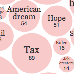
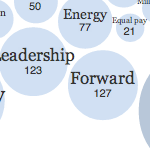
For the 2012 Republican and Democratic national conventions, Mike Bostock , Shan Carter , and Matthew Ericson
have created a series of visualizations highlighting the words being
used in the speeches of both gatherings. These word-cloud-like word
bubble clouds (what I’ll call bubble clouds, unless you can
think of a better name) serve as a great interface for looking at the
differences in the two conventions and for browsing through quotes from
the talks.
Check them out here:
While there is a lot that could be discussed about all the little things that contribute to the quality and polish of these visualizations, in this tutorial we will look at some of the implementation details that make them tick.
Try clicking on the bubbles, then try dragging them around. Change the source text with the drop down in the upper-left corner.
The source code is available for download and use in your own projects.
This visualization uses D3’s force-directed layout, so if you aren’t familiar with that, you might check out my post on creating animated bubble charts , or the designing interactive network visualizations tutorial on Flowing Data.
While I won’t be going over the basics of the force layout, hopefully there is still enough in this implementation to keep things interesting. The main topics I want to cover here are:
Ready to get started? Let’s go!
These bubble cloud visualizations actually combine SVG and Html elements elegantly! Specifically, the bubble elements themselves are circle’s inside of a SVG element, but the text on top of them is actually maintained in regular
Why would you want this duality? My initial thought when I looked at the implementation was that this was for increased browser compatibility. I figured that in IE8 users might just see the html elements, but miss out on the bubble backgrounds.
This turned out not to be the case. Navigating to the site with an old browser just gets you a static picture. The interactive versions still require browsers with SVG support.
My current guess for why this implementation route was chosen is because of how SVG deals with text wrapping.
Surprisingly, the 1.1 version of the SVG specification does not deal with word wrapping . There are some proposed workarounds , and the 1.2 spec includes the textArea element, which is supposed to solve this deficiency. But none of the solutions look particularly clean, dynamic, or without speed costs.
So the words and phrases the visualizations that will be showing might be on multiple lines. SVG doesn’t support this natively, and it looks like there are some trade-offs with the SVG only workarounds. What should we do?
Why not just implement this part in HTML? This looks to be the path Mike et al. at the New York Times took.
And this combo plater actually works out pretty well. To get started, here’s how we setup the elements that will hold the nodes and labels:
Here
So we can still use data bindings, just like in any other D3 visualization!
Now we build up our
Here we can see that each label is an
The last thing we need to do when creating these labels is determine the size of the elements holding this text. We want the text to be able to spill out a bit on either size of the bubble, but also to wrap around if it gets too long. Let’s look at one way this can be done. Here’s the code used to style and position the text:
Let’s analyze this in more detail. As the comments
say, we set our font size based on the same scale we are using to scale
the bubbles. Good. Bigger bubbles will have bigger text. We also get word wrapping for free by setting the
But if the text is actually too small for the bubble, it will skew to the left. The width will pad it out and make it not line up correctly with the bubble. So we need to find out if the bubble or the word-wrapped text is bigger.
We can do this by adding the text to a temporary span element and grabbing its actual width using getBoundingClientRect .
With this corrected width known, we can reset our label’s width to account for smaller words.
Finally, we use
Its a bit confusing, but I think its a great solution to this issue – and now that its been worked out, we can all use it.
To close off this label issue, here is how the
And there you have it. A nice way to use SVG and Html together, keeping with the D3 paradigm of binding data and using the same data backend for both.
It’s an important detail, and one that is commonly missing from even professionally created visualizations. I liked Bryan Conner’s remark on this subject when discussing the Money Ball WSJ political donor visualization :
Clicking a bubble causes an immediate change to the url. And it is this url change that serves as a signal to update the visualization. This keeps the code clean and neat . Let’s see how it works.
The functionality depends on modifying the url’s hash section which is the text that follows the hash symbol (
We use
The hash component of the url is accessible via
And then uses this event to trigger a change in the active bubble.
This decouples the event handling implementation from the visualization and would allow us to add more callbacks for
Of course you can use your own custom event to perform the same decoupling, but I think it is nice having state saving via url modification and user interaction changes wrapped up in this nice little package.
But what if you want a non-symmetrical gravity? Say your visualization is wider then it is tall (like in this example) and you want nodes to spread out along the x axis a bit more? Well, then you can implement your own ‘gravity’ function to push your nodes around how you like!
To get your own forces working on the nodes, we will call them each iteration of the force simulation by binding the force’s
Every time the
Here is the
You can see for each node we are calling
You can see how the only thing we really tweak is how much alpha affects the
The
Here we are reducing the alpha value to be applied to the
Redistributing nodes like this allows more content below it to be ‘above the fold’ without running the risk of cutting off the bottom of the bubbles.
The bubbles in these word visualizations act in a subtly but significantly different manner. Here the nodes bounce off one another, maintaining a rigid parameter space around themselves. So how is this affect achieved in D3? By implementing a custom collision detection and avoidance algorithm!
Its actually not as complicated as it might sound. Here is the code:
We compute the distance between each node pair and
see if it is less then the minimum distance allowed by our
visualization. If so, then we move the nodes away from one another. The
fact that D3 stores the current
Notice the input variable
I’ve connected the value of
If we had some rough-grained insight as to which nodes were nearest one another, we might be able to speed things up significantly by only performing these calculations for these nearby nodes.
This is actually how the NYT version of the collision algorithm is implemented. How do they know which nodes are nearby? By using a Quadtree .
A Quadtree is a tree-like data structure in which each internal node has four children (hence the name). You can use a Quadtree to partition up a two-dimensional space such that areas with more nodes will have more partitions. You can then visit the nodes in an efficient manner and stopped traversing once you have made it out of the quadrants that could affect the node in question.
D3 has a sparsely documented Quadtree implementation which is used in the force layout in this manner to make it fast. While this Quadtree implementation is a great option to have, and should be considered for collisions between many nodes, I think the brute-force version provides the same basic idea, without more technical overhead.
Again, the code is on github , so grab it and let your bubble clouds accumulate!
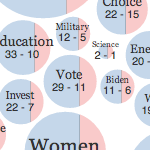
Taking this to the next level would involve splitting the bubbles based on some variable, like the dual convention version .
For that, check out Mike’s great demonstration of how they split the bubbles to get a sense of how to add this kind of visualization.
Enjoy!
Check them out here:
While there is a lot that could be discussed about all the little things that contribute to the quality and polish of these visualizations, in this tutorial we will look at some of the implementation details that make them tick.
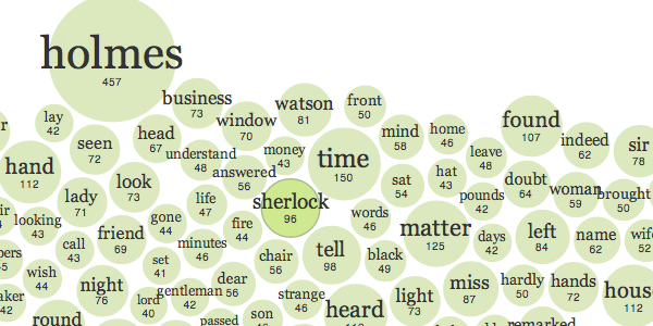
Bubble Cloud Demo
I’ve created a basic bubble cloud visualization that tries to replicate some of the functionality of the NYT version. Click on the image below to see the demo .The source code is available for download and use in your own projects.
This visualization uses D3’s force-directed layout, so if you aren’t familiar with that, you might check out my post on creating animated bubble charts , or the designing interactive network visualizations tutorial on Flowing Data.
While I won’t be going over the basics of the force layout, hopefully there is still enough in this implementation to keep things interesting. The main topics I want to cover here are:
- The use of SVG and plain html components in the same visualization
- Saving the state of the visualization using links
- Creating a custom gravity effect
- Creating a custom collision detection mechanism
Ready to get started? Let’s go!
You got Html in my SVG!
Typically when using D3 , the more advanced visualizations are made with SVG. In a previous tutorial, we dabbled in a SVG-less D3 world , but the trade-offs were steep.These bubble cloud visualizations actually combine SVG and Html elements elegantly! Specifically, the bubble elements themselves are circle’s inside of a SVG element, but the text on top of them is actually maintained in regular
div
’s. As a bonus, both sets of visual elements are backed by the data, so
there is very little code duplication or overhead using this structure.Why would you want this duality? My initial thought when I looked at the implementation was that this was for increased browser compatibility. I figured that in IE8 users might just see the html elements, but miss out on the bubble backgrounds.
This turned out not to be the case. Navigating to the site with an old browser just gets you a static picture. The interactive versions still require browsers with SVG support.
My current guess for why this implementation route was chosen is because of how SVG deals with text wrapping.
Surprisingly, the 1.1 version of the SVG specification does not deal with word wrapping . There are some proposed workarounds , and the 1.2 spec includes the textArea element, which is supposed to solve this deficiency. But none of the solutions look particularly clean, dynamic, or without speed costs.
So the words and phrases the visualizations that will be showing might be on multiple lines. SVG doesn’t support this natively, and it looks like there are some trade-offs with the SVG only workarounds. What should we do?
Why not just implement this part in HTML? This looks to be the path Mike et al. at the New York Times took.
And this combo plater actually works out pretty well. To get started, here’s how we setup the elements that will hold the nodes and labels:
      # node will be used to group the bubbles
      node = svgEnter.append("g").attr("id", "bubble-nodes")
        .attr("transform", "translate(#{margin.left},#{margin.top})")

      # label is the container div for all the labels that sit on top of
      # the bubbles
      # - remember that we are keeping the labels in plain html and
      #  the bubbles in svg
      label = d3.select(this).selectAll("#bubble-labels").data([data])
        .enter()
        .append("div")
        .attr("id", "bubble-labels")
this refers to the #vis div. For the labels, we add a container div called #bubble-labels.
Adding the circles that make up the nodes for the visualization is
stuff we have seen before, so lets focus on the labels. First we bind
the same data we use to build up the nodes to .bubble-label elements in our label selection: # ---
# updateLabels is more involved as we need to deal with getting the sizing
# to work well with the font size
# ---
updateLabels = () ->
# as in updateNodes, we use idValue to define what the unique id for each data
# point is
label = label.selectAll(".bubble-label").data(data, (d) -> idValue(d))
Now we build up our
.bubble-label ’s by entering our (currently empty) selection and appending an anchor and some divs: # labels are anchors with div's inside them
# labelEnter holds our enter selection so it
# is easier to append multiple elements to this selection
labelEnter = label.enter().append("a")
.attr("class", "bubble-label")
.attr("href", (d) -> "##{encodeURIComponent(idValue(d))}")
.call(force.drag)
.call(connectEvents)
labelEnter.append("div")
.attr("class", "bubble-label-name")
.text((d) -> textValue(d))
labelEnter.append("div")
.attr("class", "bubble-label-value")
.text((d) -> rValue(d))
a with two div
elements inside it. One to hold the word/phrase name, the other to hold
the count. We will look at how these anchors work in the next section.The last thing we need to do when creating these labels is determine the size of the elements holding this text. We want the text to be able to spill out a bit on either size of the bubble, but also to wrap around if it gets too long. Let’s look at one way this can be done. Here’s the code used to style and position the text:
    # first set the font-size and cap the maximum width to enable word wrapping
    label
      .style("font-size", (d) -> Math.max(8, rScale(rValue(d) / 2)) + "px")
      .style("width", (d) -> 2.5 * rScale(rValue(d)) + "px")

    # now we need to adjust if the width set is too big for the text
    # do this using a temporary span
    label.append("span")
      .text((d) -> textValue(d))
      .each((d) -> d.dx = Math.max(2.5 * rScale(rValue(d)), this.getBoundingClientRect().width))
      .remove()

    # reset the width of the label to the actual width
    label
      .style("width", (d) -> d.dx + "px")

    # compute 'dy' - the value to shift the text from the top
    label.each((d) -> d.dy = this.getBoundingClientRect().height)
width to an appropriate value.But if the text is actually too small for the bubble, it will skew to the left. The width will pad it out and make it not line up correctly with the bubble. So we need to find out if the bubble or the word-wrapped text is bigger.
We can do this by adding the text to a temporary span element and grabbing its actual width using getBoundingClientRect .
each is used here so we can also set the dx property of our labels, which will be used when positioning them.With this corrected width known, we can reset our label’s width to account for smaller words.
Finally, we use
getBoundingClientRect again to get the amount to shift the label down.Its a bit confusing, but I think its a great solution to this issue – and now that its been worked out, we can all use it.
To close off this label issue, here is how the
dx and dy properties are used in the tick function to position the labels: # As the labels are created in raw html and not svg, we need
# to ensure we specify the 'px' for moving based on pixels
label
.style("left", (d) -> ((margin.left + d.x) - d.dx / 2) + "px")
.style("top", (d) -> ((margin.top + d.y) - d.dy / 2) + "px")
A Way to Save State
By saving state, I mean being able to return to or share a particular view of a visualization. The way to do this in web-based interactive visualizations is by modifying the url so as to encode the current state of the visualization in the url itself.It’s an important detail, and one that is commonly missing from even professionally created visualizations. I liked Bryan Conner’s remark on this subject when discussing the Money Ball WSJ political donor visualization :
Having the ability to share a specific view as a link on Twitter or Facebook is definitely important and, as far as I’m concerned, should be standard for almost any contemporary visualization.With this bubble cloud implementation, we really only have to keep track of two variables: the text being viewed and the current word selected. I’ll focus on the word selected tracking, which we try to manage in a simple and elegant manner.
Clicking a bubble causes an immediate change to the url. And it is this url change that serves as a signal to update the visualization. This keeps the code clean and neat . Let’s see how it works.
The functionality depends on modifying the url’s hash section which is the text that follows the hash symbol (
#). Here is the click callback function, which is executed each time a bubble is clicked: # ---
# changes clicked bubble by modifying url
# ---
click = (d) ->
location.replace("#" + encodeURIComponent(idValue(d)))
d3.event.preventDefault()
location.replace to kill the previous selection (if anything was selected before) and switch to the newly highlighted bubble. The use of the replace function also means the history won’t be polluted with a bunch of versions of the same visualization.The hash component of the url is accessible via
location.hash. What’s more, we can register to be notified when this component of the url changes by using the hashchange event. Combining these insights, the bubble cloud first hooks into hashchange in the visualizations initialization function: # automatically call hashchange when the url has changed
d3.select(window)
.on("hashchange", hashchange)
# ---
# called when url after the # changes
# ---
hashchange = () ->
id = decodeURIComponent(location.hash.substring(1)).trim()
updateActive(id)
# ---
# activates new node
# ---
updateActive = (id) ->
node.classed("bubble-selected", (d) -> id == idValue(d))
# if no node is selected, id will be empty
if id.length > 0
d3.select("#status").html("
The word #{id} is now active
")
else
d3.select("#status").html("
No word is active
")
hashchange to modify other parts of the page if we wanted to. Here, we are just modifying a div, but think of the possibilities!Of course you can use your own custom event to perform the same decoupling, but I think it is nice having state saving via url modification and user interaction changes wrapped up in this nice little package.
Spreading Gravity Thin
In D3, the gravity component of a force actually draws nodes towards the center of the force layout. It is useful to ensure your nodes don’t fly off the screen. But the default gravity implementation is symmetrical, meaning it pulls on a node’s vertical and horizontal positions equally.But what if you want a non-symmetrical gravity? Say your visualization is wider then it is tall (like in this example) and you want nodes to spread out along the x axis a bit more? Well, then you can implement your own ‘gravity’ function to push your nodes around how you like!
To get your own forces working on the nodes, we will call them each iteration of the force simulation by binding the force’s
tick event to a callback function: # The force variable is the force layout controlling the bubbles
# here we disable gravity and charge as we implement custom versions
# of gravity and collisions for this visualization
force = d3.layout.force()
.gravity(0)
.charge(0)
.size([width, height])
.on("tick", tick)
tick event is triggered, it will call our function, which happens to be called tick. We also remove the built in gravity and charge forces by setting them to 0. We will implement both of these forces ourselves.Here is the
tick function: # ---
# tick callback function will be executed for every
# iteration of the force simulation
# - moves force nodes towards their destinations
# - deals with collisions of force nodes
# - updates visual bubbles to reflect new force node locations
# ---
tick = (e) ->
dampenedAlpha = e.alpha * 0.1
# Most of the work is done by the gravity and collide
# functions.
node
.each(gravity(dampenedAlpha))
.each(collide(jitter))
.attr("transform", (d) -> "translate(#{d.x},#{d.y})")
    # As the labels are created in raw html and not svg, we need
    # to ensure we specify the 'px' for moving based on pixels
    label
      .style("left", (d) -> ((margin.left + d.x) - d.dx / 2) + "px")
      .style("top", (d) -> ((margin.top + d.y) - d.dy / 2) + "px")
gravity and collide which perform all the work on our nodes. After which we update our node and label positions to their new x and y coordinates. collide will be in the next section, so let’s focus on gravity now: # ---
# custom gravity to skew the bubble placement
# ---
gravity = (alpha) ->
# start with the center of the display
cx = width / 2
cy = height / 2
# use alpha to affect how much to push
# towards the horizontal or vertical
ax = alpha / 8
ay = alpha
# return a function that will modify the
# node's x and y values
(d) ->
d.x += (cx - d.x) * ax
d.y += (cy - d.y) * ay
x and y components of the gravitational pull.The
alpha parameter comes from D3’s force layout and is the cooling temperature for the layout simulation . alpha starts at 0.1 and decreases as the force simulation continues, getting to around 0.005 before stopping.Here we are reducing the alpha value to be applied to the
x movement by 8. When we multiple the movement towards the center by ax and ay, this makes the y movement stronger. Thus, while the nodes should remain centered vertically, they will be allowed to drift along the x axis.Redistributing nodes like this allows more content below it to be ‘above the fold’ without running the risk of cutting off the bottom of the bubbles.
Don’t Burst Your Bubbles
As we saw in the bubble chart tutorial , a form of collision avoidance can be implemented in D3 by making the charge associated with each node a function of the size of the node. This provides a visually interesting, organic, experience, where bubbles push on one another in an particle-like way.The bubbles in these word visualizations act in a subtly but significantly different manner. Here the nodes bounce off one another, maintaining a rigid parameter space around themselves. So how is this affect achieved in D3? By implementing a custom collision detection and avoidance algorithm!
Its actually not as complicated as it might sound. Here is the code:
  # ---
  # custom collision function to prevent
  # nodes from touching.
  # ---
  collide = (jitter) ->
    # return a function that modifies
    # the x and y of a node
    (d) ->
      data.forEach (d2) ->
        # check that we aren't comparing a node
        # with itself
        if d != d2
          # use distance formula to find distance
          # between two nodes
          x = d.x - d2.x
          y = d.y - d2.y
          distance = Math.sqrt(x * x + y * y)
          # find current minimum space between two nodes
          # using the forceR that was set to match the
          # visible radius of the nodes
          minDistance = d.forceR + d2.forceR + collisionPadding

          # if the current distance is less then the minimum
          # allowed then we need to push both nodes away from one another
          if distance < minDistance
            # scale the distance based on the jitter variable
            distance = (distance - minDistance) / distance * jitter
            # move our two nodes
            moveX = x * distance
            moveY = y * distance
            d.x -= moveX
            d.y -= moveY
            d2.x += moveX
            d2.y += moveY
x and y
position of each node as part of the data associated with that node
makes it easy to get the values required to perform these calculations.Notice the input variable
jitter. What’s it do? We use
it to help scale the distance that will be used to move the colliding
nodes. Higher values will make this distance larger, smaller values will
reduce it.I’ve connected the value of
jitter to a range control
underneath the visualization. This lets you explore what the collisions
look like when the nodes really start pushing each other hard. The
default value, 0.5 visually seems to make the interactions look natural.The Quad Connection
The implementation as shown above is a brute-force strategy. All nodes are compared with all other nodes, regardless of how close they are in the visualization. While this works decently for a small number of nodes, it will start bogging down as the node count increases.If we had some rough-grained insight as to which nodes were nearest one another, we might be able to speed things up significantly by only performing these calculations for these nearby nodes.
This is actually how the NYT version of the collision algorithm is implemented. How do they know which nodes are nearby? By using a Quadtree .
A Quadtree is a tree-like data structure in which each internal node has four children (hence the name). You can use a Quadtree to partition up a two-dimensional space such that areas with more nodes will have more partitions. You can then visit the nodes in an efficient manner and stopped traversing once you have made it out of the quadrants that could affect the node in question.
D3 has a sparsely documented Quadtree implementation which is used in the force layout in this manner to make it fast. While this Quadtree implementation is a great option to have, and should be considered for collisions between many nodes, I think the brute-force version provides the same basic idea, without more technical overhead.
Your Own Bubble Cloud in the Sky
That does it for this tutorial. Hopefully this provides a bit more insight into these great pieces from the New York Times (and hopefully they don’t mind me continuing to exploit their great pieces).Again, the code is on github , so grab it and let your bubble clouds accumulate!
Taking this to the next level would involve splitting the bubbles based on some variable, like the dual convention version .
For that, check out Mike’s great demonstration of how they split the bubbles to get a sense of how to add this kind of visualization.
Enjoy!


