Search This Blog

Sunday, April 01, 2012

R: Plot Residuals


plot.residuals {rmutil}R Documentation

Plot Residuals

Description

plot.residuals is used for plotting residuals from models obtained from dynamic models for given subsets of the data.

Usage

plot.residuals(z, x=NULL, subset=NULL, ccov=NULL, nind=NULL,
        recursive=TRUE, pch=20, ylab="Residual", xlab=NULL,
        main=NULL, ...)

Arguments

z An object of class recursive, from carma, gar, kalcount, kalseries, kalsurv, or nbkal.
x Vector of of values for the x-axis. If missing, time is used. It can also be specified by the strings "response" or "fitted".
subset A logical vector defining which observations are to be used.
ccov If the name of a time-constant covariate is supplied, separate plots are made for each distinct value of that covariate.
nind Observation number(s) of individual(s) to be plotted.
recursive If TRUE, plot recursive residuals, otherwise ordinary residuals.
others Plotting control options.

Author(s)

J.K. Lindsey

See Also

carma, gar, kalcount, kalseries, kalsurv, nbkal plot.iprofile, plot.mprofile.

Examples

library(repeated)
times <- rep(1:20,2)
dose <- c(rep(2,20),rep(5,20))
mu <- function(p) exp(p[1]-p[3])*(dose/(exp(p[1])-exp(p[2]))*
        (exp(-exp(p[2])*times)-exp(-exp(p[1])*times)))
shape <- function(p) exp(p[1]-p[2])*times*dose*exp(-exp(p[1])*times)
conc <- matrix(rgamma(40,2,scale=mu(log(c(1,0.3,0.2)))/2),ncol=20,byrow=TRUE)
conc[,2:20] <- conc[,2:20]+0.5*(conc[,1:19]-matrix(mu(log(c(1,0.3,0.2))),
        ncol=20,byrow=TRUE)[,1:19])
conc <- ifelse(conc>0,conc,0.01)
z <- gar(conc, dist="gamma", times=1:20, mu=mu, shape=shape,
        preg=log(c(1,0.4,0.1)), pdepend=0.1, pshape=log(c(1,0.2)))
plot.residuals(z, subset=1:20, main="Dose 1")
plot.residuals(z, x="fitted", subset=1:20, main="Dose 1")
plot.residuals(z, x="response", subset=1:20, main="Dose 1")

[Package rmutil version 1.0 Index]

R: Calculate Residuals Statistics and Likelihood


residualStats {dse1}R Documentation

Calculate Residuals Statistics and Likelihood

Description

Calculate the residuals statistics and likelihood of a residual.

Usage

    residualStats(pred, data, sampleT=nrow(pred), warn=TRUE)

Arguments

pred A matrix with columns representing time series.
data A matrix with columns representing time series.
sampleT An integer indicating the sample to use.
warn If FALSE certain warnings are suppressed.

Details

Residuals are calculated as pred[1:sampleT,,drop=FALSE] - data[1:sampleT,,drop=FALSE] and then statistics are calculated based on these residuals. If pred or data are NULL they are treated as zero.

Value

A list with elements like, cov, pred, and sampleT. pred and sampleT are as supplied (and are returned as this is a utility function called by other functions and it is convenient to pass them along). cov is the covariance of the residual and like is a vector of four elements representing the total, constant, determinant and covariance terms of the negative log likelihood function.

See Also

l

Examples

    residualStats(matrix(rnorm(200), 100,2), NULL) # but typically used for a residual

[Package dse1 version 2007.7-1 Index]

R: Fit Generalized Extreme Value Distribution


gev {evir}R Documentation

Fit Generalized Extreme Value Distribution

Description

Fits generalized extreme value distribution (GEV) to block maxima data.

Usage

gev(data, block = NA, ...)

Arguments

data data vector. Interpretation depends on value of block: if no block size is specified then data are interpreted as block maxima; if block size is set, then data are interpreted as raw data and block maxima are calculated.
block the block size. A numeric value is interpreted as the number of data values in each successive block. All the data is used, so the last block may not contain block observations. If the data has a times attribute containing (in an object of class "POSIXct", or an object that can be converted to that class; see as.POSIXct) the times/dates of each observation, then block may instead take the character values "month", "quarter", "semester" or "year".
... arguments passed to optim

Value

An object of class gev describing the fit and including parameter estimates and standard errors. Fitting is carried out using maximum likelihood.

See Also

plot.gev, gumbel, optim, as.POSIXct

Examples

# Fit GEV to monthly maxima
data(bmw)
out <- gev(bmw, "month") 
# Fit GEV to maxima of blocks of 100 observations
out <- gev(bmw, 100) 
# Fit GEV to the data in nidd.annual, the annual maximum water 
# levels of the River Nidd, using the "BFGS" optimization method
data(nidd.annual) 
out <- gev(nidd.annual, method = "BFGS", control = list(maxit = 500))   

[Package evir version 1.6 Index]

R: Maximum-likelihood Fitting of the GEV Distribution Description


gev.fit {ismev}R Documentation

Maximum-likelihood Fitting of the GEV Distribution

Description

Maximum-likelihood fitting for the generalized extreme value distribution, including generalized linear modelling of each parameter.

Usage

gev.fit(xdat, ydat = NULL, mul = NULL, sigl = NULL, shl = NULL, 
    mulink = identity, siglink = identity, shlink = identity, 
    show = TRUE, method = "Nelder-Mead", maxit = 10000, ...)

Arguments

xdat A numeric vector of data to be fitted.
ydat A matrix of covariates for generalized linear modelling of the parameters (or NULL (the default) for stationary fitting). The number of rows should be the same as the length of xdat.
mul, sigl, shl Numeric vectors of integers, giving the columns of ydat that contain covariates for generalized linear modelling of the location, scale and shape parameters repectively (or NULL (the default) if the corresponding parameter is stationary).
mulink, siglink, shlink Inverse link functions for generalized linear modelling of the location, scale and shape parameters repectively.
show Logical; if TRUE (the default), print details of the fit.
method The optimization method (see optim for details).
maxit The maximum number of iterations.
... Other control parameters for the optimization. These are passed to components of the control argument of optim.

Details

For non-stationary fitting it is recommended that the covariates within the generalized linear models are (at least approximately) centered and scaled (i.e. the columns of ydat should be approximately centered and scaled).

Value

A list containing the following components. A subset of these components are printed after the fit. If show is TRUE, then assuming that successful convergence is indicated, the components nllh, mle and se are always printed.
trans An logical indicator for a non-stationary fit.
model A list with components mul, sigl and shl.
link A character vector giving inverse link functions.
conv The convergence code, taken from the list returned by optim. A zero indicates successful convergence.
nllh The negative logarithm of the likelihood evaluated at the maximum likelihood estimates.
data The data that has been fitted. For non-stationary models, the data is standardized.
mle A vector containing the maximum likelihood estimates.
cov The covariance matrix.
se A vector containing the standard errors.
vals A matrix with three columns containing the maximum likelihood estimates of the location, scale and shape parameters at each data point.

See Also

gev.diag, optim, gev.prof

Examples

data(portpirie)
gev.fit(portpirie[,2])

R: Generalized Extreme Value Distribution Family Function


gev {VGAM}R Documentation

Generalized Extreme Value Distribution Family Function

Description

Maximum likelihood estimation of the 3-parameter generalized extreme value (GEV) distribution.

Usage

gev(llocation = "identity", lscale = "loge", lshape = "logoff",
    elocation = list(), escale = list(),
    eshape = if(lshape=="logoff") list(offset=0.5) else
    if(lshape=="elogit") list(min=-0.5, max=0.5) else list(),
    percentiles = c(95, 99),
    iscale=NULL, ishape = NULL,
    method.init = 1, gshape=c(-0.45, 0.45), tshape0=0.001, zero = 3)
egev(llocation = "identity", lscale = "loge", lshape = "logoff",
     elocation = list(), escale = list(),
     eshape = if(lshape=="logoff") list(offset=0.5) else
     if(lshape=="elogit") list(min=-0.5, max=0.5) else list(),
     percentiles = c(95, 99),
     iscale=NULL,  ishape = NULL,
     method.init=1, gshape=c(-0.45, 0.45), tshape0=0.001, zero = 3)

Arguments

llocation, lscale, lshape Parameter link functions for mu, sigma and xi respectively. See Links for more choices.
elocation, escale, eshape List. Extra argument for the respective links. See earg in Links for general information. For the shape parameter, if the logoff link is chosen then the offset is called A below; and then the linear/additive predictor is log(xi+A) which means that xi > -A. For technical reasons (see Details) it is a good idea for A=0.5.
percentiles Numeric vector of percentiles used for the fitted values. Values should be between 0 and 100. However, if percentiles=NULL, then the mean mu + sigma * (gamma(1-xi)-1)/xi is returned, and this is only defined if xi<1.
iscale, ishape Numeric. Initial value for sigma and xi. A NULL means a value is computed internally. The argument ishape is more important than the other two because they are initialized from the initial xi. If a failure to converge occurs, or even to obtain initial values occurs, try assigning ishape some value (positive or negative; the sign can be very important). Also, in general, a larger value of iscale is better than a smaller value.
method.init Initialization method. Either the value 1 or 2. Method 1 involves choosing the best xi on a course grid with endpoints gshape. Method 2 is similar to the method of moments. If both methods fail try using ishape.
gshape Numeric, of length 2. Range of xi used for a grid search for a good initial value for xi. Used only if method.init equals 1.
tshape0 Positive numeric. Threshold/tolerance value for resting whether xi is zero. If the absolute value of the estimate of xi is less than this value then it will be assumed zero and Gumbel derivatives etc. will be used.
zero An integer-valued vector specifying which linear/additive predictors are modelled as intercepts only. The values must be from the set {1,2,3} corresponding respectively to mu, sigma, xi. If zero=NULL then all linear/additive predictors are modelled as a linear combination of the explanatory variables. For many data sets having zero=3 is a good idea.

Details

The GEV distribution function can be written
G(y) = exp( -[ (y- mu)/ sigma ]_{+}^{- 1/ xi})
where sigma > 0, -Inf < mu < Inf, and 1 + xi*(y-mu)/sigma > 0. Here, x_+ = max(x,0). The mu, sigma, xi are known as the location, scale and shape parameters respectively. The cases xi>0, xi<0, xi=0 correspond to the Frechet, Weibull, and Gumbel types respectively. It can be noted that the Gumbel (or Type I) distribution accommodates many commonly-used distributions such as the normal, lognormal, logistic, gamma, exponential and Weibull.
For the GEV distribution, the kth moment about the mean exists if xi < 1/k. Provided they exist, the mean and variance are given by mu + sigma { Gamma(1-xi)-1} / xi and sigma^2 { Gamma(1-2 xi) - Gamma^2 (1- xi) } / xi^2 respectively, where Gamma is the gamma function.
Smith (1985) established that when xi > -0.5, the maximum likelihood estimators are completely regular. To have some control over the estimated xi try using lshape="logoff" and the eshape=list(offset=0.5), say, or lshape="elogit" and eshape=list(min=-0.5, max=0.5), say.

Value

An object of class "vglmff" (see vglmff-class). The object is used by modelling functions such as vglm, and vgam.

Warning

Currently, if an estimate of xi is too close to zero then an error will occur for gev() with multivariate responses. In general, egev() is more reliable than gev().
Fitting the GEV by maximum likelihood estimation can be numerically fraught. If 1 + xi*(y-mu)/sigma <= 0 then some crude evasive action is taken but the estimation process can still fail. This is particularly the case if vgam with s is used; then smoothing is best done with vglm with regression splines (bs or ns) because vglm implements half-stepsizing whereas vgam doesn't (half-stepsizing helps handle the problem of straying outside the parameter space.)

Note

The VGAM family function gev can handle a multivariate (matrix) response. If so, each row of the matrix is sorted into descending order and NAs are put last. With a vector or one-column matrix response using egev will give the same result but be faster and it handles the xi=0 case. The function gev implements Tawn (1988) while egev implements Prescott and Walden (1980).
The shape parameter xi is difficult to estimate accurately unless there is a lot of data. Convergence is slow when xi is near -0.5. Given many explanatory variables, it is often a good idea to make sure zero=3. The range restrictions of the parameter xi are not enforced; thus it is possible for a violation to occur.
Successful convergence often depends on having a reasonably good initial value for xi. If failure occurs try various values for the argument ishape, and if there are covariates, having zero=3 is advised.

Author(s)

T. W. Yee

References

Yee, T. W. and Stephenson, A. G. (2007) Vector generalized linear and additive extreme value models. Extremes, 10, 1–19.
Tawn, J. A. (1988) An extreme-value theory model for dependent observations. Journal of Hydrology, 101, 227–250.
Prescott, P. and Walden, A. T. (1980) Maximum likelihood estimation of the parameters of the generalized extreme-value distribution. Biometrika, 67, 723–724.
Smith, R. L. (1985) Maximum likelihood estimation in a class of nonregular cases. Biometrika, 72, 67–90.

See Also

rgev, gumbel, egumbel, guplot, rlplot.egev, gpd, elogit, oxtemp, venice.

Examples

# Multivariate example
data(venice)
y = as.matrix(venice[,paste("r", 1:10, sep="")])
fit1 = vgam(y[,1:2] ~ s(year, df=3), gev(zero=2:3), venice, trace=TRUE)
coef(fit1, matrix=TRUE)
fitted(fit1)[1:4,]
## Not run: 
par(mfrow=c(1,2), las=1)
plot(fit1, se=TRUE, lcol="blue", scol="forestgreen",
     main="Fitted mu(year) function (centered)")
attach(venice)
matplot(year, y[,1:2], ylab="Sea level (cm)", col=1:2,
        main="Highest 2 annual sealevels and fitted 95 percentile")
lines(year, fitted(fit1)[,1], lty="dashed", col="blue")
detach(venice)
## End(Not run)

# Univariate example
data(oxtemp)
(fit = vglm(maxtemp ~ 1, egev, data=oxtemp, trace=TRUE))
fitted(fit)[1:3,]
coef(fit, mat=TRUE)
Coef(fit)
vcov(fit)
vcov(fit, untransform=TRUE)
sqrt(diag(vcov(fit)))   # Approximate standard errors
## Not run:  rlplot(fit) 

[Package VGAM version 0.7-4 Index]
R: Pareto Distribution


Pareto {rmutil}R Documentation

Pareto Distribution

Description

These functions provide information about the Pareto distribution with location parameter equal to m and dispersion equal to s: density, cumulative distribution, quantiles, log hazard, and random generation.
The Pareto distribution has density
f(y) = s (1 + y/(m (s-1)))^(-s-1)/(m (s-1))
where m is the mean parameter of the distribution and s is the dispersion.
This distribution can be obtained as a mixture distribution from the exponential distribution using a gamma mixing distribution.

Usage

dpareto(y, m, s, log=FALSE)
ppareto(q, m, s)
qpareto(p, m, s)
hpareto(y, m, s)
rpareto(n, m, s)

Arguments

y vector of responses.
q vector of quantiles.
p vector of probabilities
n number of values to generate
m vector of location parameters.
s vector of dispersion parameters.
log if TRUE, log probabilities are supplied.

Author(s)

J.K. Lindsey

See Also

dexp for the exponential distribution.

Examples

dpareto(5, 2, 2)
ppareto(5, 2, 2)
qpareto(0.9, 2, 2)
rpareto(10, 2, 2)

[Package rmutil version 1.0 Index]

R: The Pareto Distribution


Pareto {VGAM}R Documentation

The Pareto Distribution

Description

Density, distribution function, quantile function and random generation for the Pareto(I) distribution with parameters location and shape.

Usage

dpareto(x, location, shape, log=FALSE)
ppareto(q, location, shape)
qpareto(p, location, shape)
rpareto(n, location, shape)

Arguments

x, q vector of quantiles.
p vector of probabilities.
n number of observations. Must be a single positive integer.
location, shape the alpha and k parameters.
log Logical. If log=TRUE then the logarithm of the density is returned.

Details

See pareto1, the VGAM family function for estimating the parameter k by maximum likelihood estimation, for the formula of the probability density function and the range restrictions imposed on the parameters.

Value

dpareto gives the density, ppareto gives the distribution function, qpareto gives the quantile function, and rpareto generates random deviates.

Author(s)

T. W. Yee

References

Evans, M., Hastings, N. and Peacock, B. (2000) Statistical Distributions, New York: Wiley-Interscience, Third edition.

See Also

pareto1, ParetoIV.

Examples

alpha = 3; k = exp(1); x = seq(2.8, 8, len=300)
## Not run: 
plot(x, dpareto(x, location=alpha, shape=k), type="l",
     main="Pareto density split into 10 equal areas")
abline(h=0, col="blue", lty=2)
qq = qpareto(seq(0.1,0.9,by=0.1),location=alpha,shape=k)
lines(qq, dpareto(qq, loc=alpha, shape=k), col="purple", lty=3, type="h")
## End(Not run)
pp = seq(0.1,0.9,by=0.1)
qq = qpareto(pp, location=alpha, shape=k)
ppareto(qq, location=alpha, shape=k)
qpareto(ppareto(qq,loc=alpha,shape=k),loc=alpha,shape=k) - qq # Should be 0

[Package VGAM version 0.7-9 Index]

R: The Exponential Distribution


The Exponential Distribution

Usage

dexp(x, rate = 1)
pexp(q, rate = 1)
qexp(p, rate = 1)
rexp(n, rate = 1)

Arguments

x q vector of quantiles.
p vector of probabilities.
n number of observations to generate.
rate vector of rates.

Value

These functions provide information about the exponential distribution with rate rate (i.e., mean 1/rate). dexp gives the density, pexp gives the distribution function, qexp gives the quantile function and rexp generates random deviates. If rate is not specified, it assumes the default value of 1.
The exponential distribution with rate &lambda has density
f(x) = lambda e^(- lambda x)
for x >= 0.

See Also

exp for the exponential function, dgamma for the gamma distribution and dweibull for the Weibull distribution, both of which generalize the exponential.

Examples

dexp(1) - exp(-1) #-> 0
r <- rexp(100)
all(abs(1 - dexp(1, r) / (r*exp(-r))) < 1e-14)

R: Mean Excess Plot


meplot {VGAM}R Documentation

Mean Excess Plot

Description

Mean excess plot (also known as a mean residual life plot), a diagnostic plot for the generalized Pareto distribution (GPD).

Usage

meplot(object, ...)
meplot.default(y, main="Mean Excess Plot",
    xlab="Threshold", ylab="Mean Excess", lty=c(2,1:2),
    conf=0.95, col=c("blue","black","blue"), type="l", ...)
meplot.vlm(object, ...)

Arguments

y A numerical vector. NAs etc. are not allowed.
main Character. Overall title for the plot.
xlab Character. Title for the x axis.
ylab Character. Title for the y axis.
lty Line type. The second value is for the mean excess value, the first and third values are for the envelope surrounding the confidence interval.
conf Confidence level. The default results in approximate 95 percent confidence intervals for each mean excess value.
col Colour of the three lines.
type Type of plot. The default means lines are joined between the mean excesses and also the upper and lower limits of the confidence intervals.
object An object that inherits class "vlm", usually of class vglm-class or vgam-class.
... Graphical argument passed into plot. See par for an exhaustive list. The arguments xlim and ylim are particularly useful.

Details

If Y has a GPD with scale parameter sigma and shape parameter xi<1, and if y>0, then
E(Y-u|Y>u) = frac{σ+xi u}{1-xi}.
It is a linear function in u, the threshold. Note that Y-u is called the excess and values of Y greater than u are called exceedences. The empirical versions used by these functions is to use sample means to estimate the left hand side of the equation. Values of u in the plot are the values of y itself. If the plot is roughly a straight line then the GPD is a good fit; this plot can be used to select an appropriate threshold value. See gpd for more details. If the plot is flat then the data may be exponential, and if it is curved then it may be Weibull or gamma.
The function meplot is generic, and meplot.default and meplot.vlm are some methods functions for mean excess plots.

Value

A list is returned invisibly with the following components.
threshold The x axis values.
meanExcess The y axis values. Each value is a sample mean minus a value u.

Note

The function is designed for speed and not accuracy, therefore huge data sets with extremely large values may cause failure (the function cumsum is used.) Ties may not be well handled.

Author(s)

T. W. Yee

References

Davison, A. C. and Smith, R. L. (1990) Models for exceedances over high thresholds (with discussion). Journal of the Royal Statistical Society, Series B, Methodological, 52, 393–442.
Coles, S. (2001) An Introduction to Statistical Modeling of Extreme Values. London: Springer-Verlag.

See Also

gpd.

Examples

## Not run: 
meplot(runif(500), las=1) -> i
names(i)
## End(Not run)

[Package VGAM version 0.7-9 Index]

R: Explorative Data Analysis


ExtremesData {fExtremes}R Documentation

Explorative Data Analysis

Description

A collection and description of functions for explorative data analysis. The tools include plot functions for emprical distributions, quantile plots, graphs exploring the properties of exceedences over a threshold, plots for mean/sum ratio and for the development of records.

The functions are:
emdPlot Plot of empirical distribution function,
qqparetoPlot Exponential/Pareto quantile plot,
mePlot Plot of mean excesses over a threshold,
mrlPlot another variant, mean residual life plot,
mxfPlot another variant, with confidence intervals,
msratioPlot Plot of the ratio of maximum and sum,
recordsPlot Record development compared with iid data,
ssrecordsPlot another variant, investigates subsamples,
sllnPlot verifies Kolmogorov's strong law of large numbers,
lilPlot verifies Hartman-Wintner's law of the iterated logarithm,
xacfPlot ACF of exceedences over a threshold,
normMeanExcessFit fits mean excesses with a normal density,
ghMeanExcessFit fits mean excesses with a GH density,
hypMeanExcessFit fits mean excesses with a HYP density,
nigMeanExcessFit fits mean excesses with a NIG density,
ghtMeanExcessFit fits mean excesses with a GHT density.

Usage

emdPlot(x, doplot = TRUE, plottype = c("xy", "x", "y", " "), 
    labels = TRUE, ...)

qqparetoPlot(x, xi = 0, trim = NULL, threshold = NULL, doplot = TRUE, 
    labels = TRUE, ...)

mePlot(x, doplot = TRUE, labels = TRUE, ...)
mrlPlot(x, ci = 0.95, umin = mean(x), umax = max(x), nint = 100, doplot = TRUE, 
     plottype = c("autoscale", ""), labels = TRUE, ...)  
mxfPlot(x, u = quantile(x, 0.05), doplot = TRUE, labels = TRUE, ...)  
   
msratioPlot(x, p = 1:4, doplot = TRUE, labels = TRUE, ...) 
   
recordsPlot(x, ci = 0.95, doplot = TRUE, labels = TRUE, ...)
ssrecordsPlot(x, subsamples = 10, doplot = TRUE, plottype = c("lin", "log"),
    labels = TRUE, ...)
    
sllnPlot(x, doplot = TRUE, labels = TRUE, ...)
lilPlot(x, doplot = TRUE, labels = TRUE, ...)

xacfPlot(x, u = quantile(x, 0.95), lag.max = 15, doplot = TRUE, 
    which = c("all", 1, 2, 3, 4), labels = TRUE, ...)
    
normMeanExcessFit(x, doplot = TRUE, trace = TRUE, ...)
ghMeanExcessFit(x, doplot = TRUE, trace = TRUE, ...)
hypMeanExcessFit(x, doplot = TRUE, trace = TRUE, ...)
nigMeanExcessFit(x, doplot = TRUE, trace = TRUE, ...)
ghtMeanExcessFit(x, doplot = TRUE, trace = TRUE, ...)

Arguments

ci [recordsPlot] -
a confidence level. By default 0.95, i.e. 95%.
doplot a logical value. Should the results be plotted? By default TRUE.
labels a logical value. Whether or not x- and y-axes should be automatically labelled and a default main title should be added to the plot. By default TRUE.
lag.max [xacfPlot] -
maximum number of lags at which to calculate the autocorrelation functions. The default value is 15.
nint [mrlPlot] -
the number of intervals, see umin and umax. The default value is 100.
p [msratioPlot] -
the power exponents, a numeric vector. By default a sequence from 1 to 4 in unit integer steps.
plottype [emdPlot] -
which axes should be on a log scale: "x" x-axis only; "y" y-axis only; "xy" both axes; "" neither axis.
[msratioPlot] -
a logical, if set to "autoscale", then the scale of the plots are automatically determined, any other string allows user specified scale information through the ... argument.
[ssrecordsPlot] -
one from two options can be select either "lin" or "log". The default creates a linear plot.
subsamples [ssrecordsPlot] -
the number of subsamples, by default 10, an integer value.
threshold, trim [qPlot][xacfPlot] -
a numeric value at which data are to be left-truncated, value at which data are to be right-truncated or the thresold value, by default 95%.
trace a logical flag, by default TRUE. Should the calculations be traced?
u a numeric value at which level the data are to be truncated. By default the threshold value which belongs to the 95% quantile, u=quantile(x,0.95).
umin, umax [mrlPlot] -
range of threshold values. If umin and/or umax are not available, then by default they are set to the following values: umin=mean(x) and umax=max(x).
which [xacfPlot] -
a numeric or character value, if which="all" then all four plots are displayed, if which is an integer between one and four, then the first, second, third or fourth plot will be displayed.
x, y numeric data vectors or in the case of x an object to be plotted.
xi the shape parameter of the generalized Pareto distribution.
... additional arguments passed to the FUN or plot function.

Details

Empirical Distribution Function:

The function emdPlot is a simple explanatory function. A straight line on the double log scale indicates Pareto tail behaviour.

Quantile–Quantile Pareto Plot:

qqparetoPlot creates a quantile-quantile plot for threshold data. If xi is zero the reference distribution is the exponential; if xi is non-zero the reference distribution is the generalized Pareto with that parameter value expressed by xi. In the case of the exponential, the plot is interpreted as follows: Concave departures from a straight line are a sign of heavy-tailed behaviour, convex departures show thin-tailed behaviour.

Mean Excess Function Plot:

Three variants to plot the mean excess function are available: A sample mean excess plot over increasing thresholds, and two mean excess function plots with confidence intervals for discrimination in the tails of a distribution. In general, an upward trend in a mean excess function plot shows heavy-tailed behaviour. In particular, a straight line with positive gradient above some threshold is a sign of Pareto behaviour in tail. A downward trend shows thin-tailed behaviour whereas a line with zero gradient shows an exponential tail. Here are some hints: Because upper plotting points are the average of a handful of extreme excesses, these may be omitted for a prettier plot. For mrlPlot and mxfPlot the upper tail is investigated; for the lower tail reverse the sign of the data vector.

Plot of the Maximum/Sum Ratio:

The ratio of maximum and sum is a simple tool for detecting heavy tails of a distribution and for giving a rough estimate of the order of its finite moments. Sharp increases in the curves of a msratioPlot are a sign for heavy tail behaviour.

Plot of the Development of Records:

These are functions that investigate the development of records in a dataset and calculate the expected behaviour for iid data. recordsPlot counts records and reports the observations at which they occur. In addition subsamples can be investigated with the help of the function ssrecordsPlot.

Plot of Kolmogorov's and Hartman-Wintern's Laws:

The function sllnPlot verifies Kolmogorov's strong law of large numbers, and the function lilPlot verifies Hartman-Wintner's law of the iterated logarithm.

ACF Plot of Exceedences over a Thresold:

This function plots the autocorrelation functions of heights and distances of exceedences over a threshold.

Value

The functions return a plot.

Note

The plots are labeled by default with a x-label, a y-label and a main title. If the argument labels is set to FALSE neither a x-label, a y-label nor a main title will be added to the graph. To add user defined label strings just use the function title(xlab="\dots", ylab="\dots", main="\dots").

Author(s)

Some of the functions were implemented from Alec Stephenson's R-package evir ported from Alexander McNeil's S library EVIS, Extreme Values in S, some from Alec Stephenson's R-package ismev based on Stuart Coles code from his book, Introduction to Statistical Modeling of Extreme Values and some were written by Diethelm Wuertz.

References

Coles S. (2001); Introduction to Statistical Modelling of Extreme Values, Springer.
Embrechts, P., Klueppelberg, C., Mikosch, T. (1997); Modelling Extremal Events, Springer.

Examples

 
## Danish fire insurance data:
   data(danishClaims)
   danishClaims = as.timeSeries(danishClaims)
   
## emdPlot -
   # Show Pareto tail behaviour:
   par(mfrow = c(2, 2), cex = 0.7)
   emdPlot(danishClaims) 
   
## qqparetoPlot -
   # QQ-Plot of heavy-tailed Danish fire insurance data:
   qqparetoPlot(danishClaims, xi = 0.7) 
 
## mePlot -
   # Sample mean excess plot of heavy-tailed Danish fire:
   mePlot(danishClaims)
      
## ssrecordsPlot -
   # Record fire insurance losses in Denmark:
   ssrecordsPlot(danishClaims, subsamples = 10) 

[Package fExtremes version 2100.77 Index]

R: Sample Mean Excess Plot


meplot {evir}R Documentation

Sample Mean Excess Plot

Description

Plots sample mean excesses over increasing thresholds.

Usage

meplot(data, omit = 3, labels = TRUE, ...)

Arguments

data data vector
omit number of upper plotting points to be omitted
labels whether or not axes are to be labelled
... other graphics parameters

Details

An upward trend in plot shows heavy-tailed behaviour. In particular, a straight line with positive gradient above some threshold is a sign of Pareto behaviour in tail. A downward trend shows thin-tailed behaviour whereas a line with zero gradient shows an exponential tail. Because upper plotting points are the average of a handful of extreme excesses, these may be omitted for a prettier plot.

See Also

gpd, qplot

Examples

## Not run: data(danish)
## Not run: meplot(danish) 
# Sample mean excess plot of heavy-tailed Danish fire insurance data 

[Package evir version 1.5 Index]

R: Generalized Extreme Value Modelling


GevModelling {fExtremes}R Documentation

Generalized Extreme Value Modelling

Description

A collection and description functions to estimate the parameters of the GEV distribution. To model the GEV three types of approaches for parameter estimation are provided: Maximum likelihood estimation, probability weighted moment method, and estimation by the MDA approach. MDA includes functions for the Pickands, Einmal-Decker-deHaan, and Hill estimators together with several plot variants.

The GEV modelling functions are:
gevSim generates data from the GEV distribution,
gumbelSim generates data from the Gumbel distribution,
gevFit fits data to the GEV distribution,
gumbelFit fits data to the Gumbel distribution,
print print method for a fitted GEV object,
plot plot method for a fitted GEV object,
summary summary method for a fitted GEV object,
gevrlevelPlot k-block return level with confidence intervals.

Usage

gevSim(model = list(xi = -0.25, mu = 0, beta = 1), n = 1000, seed = NULL)
gumbelSim(model = list(mu = 0, beta = 1), n = 1000, seed = NULL)

gevFit(x, block = 1, type = c("mle", "pwm"), title = NULL, description = NULL, ...)
gumbelFit(x, block = 1, type = c("mle", "pwm"), title = NULL, description = NULL, ...)

## S4 method for signature 'fGEVFIT'
show(object)
## S3 method for class 'fGEVFIT'
plot(x, which = "ask", ...)
## S3 method for class 'fGEVFIT'
summary(object, doplot = TRUE, which = "all", ...)

Arguments

block block size.
description a character string which allows for a brief description.
doplot a logical. Should the results be plotted?
[shaparmPlot] -
a vector of logicals of the same lengths as tails defining for wich tail depths plots should be created, by default plots will be generated for a tail depth of 5 percent. By default c(FALSE, FALSE, FALSE, FALSE, TRUE, FALSE, FALSE, FALSE, FALSE, FALSE).
model [gevSim][gumbelSim] -
a list with components shape, location and scale giving the parameters of the GEV distribution. By default the shape parameter has the value -0.25, the location is zero and the scale is one. To fit random deviates from a Gumbel distribution set shape=0.
n [gevSim][gumbelSim] -
number of generated data points, an integer value.
[rgev] -
the number of observations.
object [summary][grlevelPlot] -
a fitted object of class "gevFit".
seed [gevSim] -
an integer value to set the seed for the random number generator.
title [gevFit] -
a character string which allows for a project title.
type a character string denoting the type of parameter estimation, either by maximum likelihood estimation "mle", the default value, or by the probability weighted moment menthod "pwm".
which [plot][summary] -
a vector of logicals, one for each plot, denoting which plot should be displayed. Alkternatively if which="ask" the user will be interactively asked which of the plots should be desplayed. By default which="all".
x [dgev][devd] -
a numeric vector of quantiles.
[gevFit] -
data vector. In the case of method="mle" the interpretation depends on the value of block: if no block size is specified then data are interpreted as block maxima; if block size is set, then data are interpreted as raw data and block maxima are calculated.
[hillPlot][shaparmPlot] -
the data from which to calculate the shape parameter, a numeric vector.
[print][plot] -
a fitted object of class "gevFit".
xi, mu, beta [*gev] -
xi is the shape parameter, mu the location parameter, and sigma is the scale parameter. The default values are xi=1, mu=0, and beta=1. Note, if xi=0 the distribution is of type Gumbel.
... [gevFit] -
control parameters optionally passed to the optimization function. Parameters for the optimization function are passed to components of the control argument of optim.
[hillPlot] -
other graphics parameters.
[plot][summary] -
arguments passed to the plot function.

Details

Parameter Estimation:

gevFit and gumbelFit estimate the parameters either by the probability weighted moment method, method="pwm" or by maximum log likelihood estimation method="mle". The summary method produces diagnostic plots for fitted GEV or Gumbel models.

Methods:

print.gev, plot.gev and summary.gev are print, plot, and summary methods for a fitted object of class gev. Concerning the summary method, the data are converted to unit exponentially distributed residuals under null hypothesis that GEV fits. Two diagnostics for iid exponential data are offered. The plot method provides two different residual plots for assessing the fitted GEV model. Two diagnostics for iid exponential data are offered.

Return Level Plot:

gevrlevelPlot calculates and plots the k-block return level and 95% confidence interval based on a GEV model for block maxima, where k is specified by the user. The k-block return level is that level exceeded once every k blocks, on average. The GEV likelihood is reparameterized in terms of the unknown return level and profile likelihood arguments are used to construct a confidence interval.

Hill Plot:

The function hillPlot investigates the shape parameter and plots the Hill estimate of the tail index of heavy-tailed data, or of an associated quantile estimate. This plot is usually calculated from the alpha perspective. For a generalized Pareto analysis of heavy-tailed data using the gpdFit function, it helps to plot the Hill estimates for xi.

Shape Parameter Plot:

The function shaparmPlot investigates the shape parameter and plots for the upper and lower tails the shape parameter as a function of the taildepth. Three approaches are considered, the Pickands estimator, the Hill estimator, and the Decker-Einmal-deHaan estimator.

Value

gevSim
returns a vector of data points from the simulated series.

gevFit
returns an object of class gev describing the fit.

print.summary
prints a report of the parameter fit.

summary
performs diagnostic analysis. The method provides two different residual plots for assessing the fitted GEV model.

gevrlevelPlot
returns a vector containing the lower 95% bound of the confidence interval, the estimated return level and the upper 95% bound.

hillPlot
displays a plot.

shaparmPlot
returns a list with one or two entries, depending on the selection of the input variable both.tails. The two entries upper and lower determine the position of the tail. Each of the two variables is again a list with entries pickands, hill, and dehaan. If one of the three methods will be discarded the printout will display zeroes.

Note

GEV Parameter Estimation:

If method "mle" is selected the parameter fitting in gevFit is passed to the internal function gev.mle or gumbel.mle depending on the value of gumbel, FALSE or TRUE. On the other hand, if method "pwm" is selected the parameter fitting in gevFit is passed to the internal function gev.pwm or gumbel.pwm again depending on the value of gumbel, FALSE or TRUE.

Author(s)

Alec Stephenson for R's evd and evir package, and
Diethelm Wuertz for this R-port.

References

Coles S. (2001); Introduction to Statistical Modelling of Extreme Values, Springer.
Embrechts, P., Klueppelberg, C., Mikosch, T. (1997); Modelling Extremal Events, Springer.

Examples

## gevSim -
   # Simulate GEV Data, use default length n=1000
   x = gevSim(model = list(xi = 0.25, mu = 0 , beta = 1), n = 1000)
   head(x)

## gumbelSim -
   # Simulate GEV Data, use default length n=1000
   x = gumbelSim(model = list(xi = 0.25, mu = 0 , beta = 1))
     
## gevFit -
   # Fit GEV Data by Probability Weighted Moments:
   fit = gevFit(x, type = "pwm") 
   print(fit)
   
## summary -
   # Summarize Results:
   par(mfcol = c(2, 2))
   summary(fit)

[Package fExtremes version 2100.77 Index]

R: Return Level Plot for GEV Fits


rlplot.egev {VGAM}R Documentation

Return Level Plot for GEV Fits

Description

A return level plot is constructed for a GEV-type model.

Usage

rlplot.egev(object, plot.it = TRUE,
    probability = c((1:9)/100, (1:9)/10, 0.95, 0.99, 0.995, 0.999),
    add.arg = FALSE, xlab = "Return Period", ylab = "Return Level",
    main = "Return Level Plot",
    pch = par()$pch, pcol.arg = par()$col, pcex = par()$cex,
    llty.arg = par()$lty, lcol.arg = par()$col, llwd.arg = par()$lwd,
    slty.arg = par()$lty, scol.arg = par()$col, slwd.arg = par()$lwd,
    ylim = NULL, Log = TRUE, CI = TRUE, epsilon = 1e-05, ...)

Arguments

object A VGAM extremes model of the GEV-type, produced by vglm with a family function either "gev" or "egev".
plot.it Logical. Plot it? If FALSE no plot will be done.
probability Numeric vector of probabilities used.
add.arg Logical. Add the plot to an existing plot?
xlab Caption for the x-axis. See par.
ylab Caption for the y-axis. See par.
main Title of the plot. See title.
pch Plotting character. See par.
pcol.arg Color of the points. See the col argument of par.
pcex Character expansion of the points. See the cex argument of par.
llty.arg Line type. Line type. See the lty argument of par.
lcol.arg Color of the lines. See the col argument of par.
llwd.arg Line width. See the lwd argument of par.
slty.arg, scol.arg, slwd.arg Correponding arguments for the lines used for the confidence intervals. Used only if CI=TRUE.
ylim Limits for the y-axis. Numeric of length 2.
Log Logical. If TRUE then log="" otherwise log="x". This changes the labelling of the x-axis only.
CI Logical. Add in a 95 percent confidence interval?
epsilon Numeric, close to zero. Used for the finite-difference approximation to the first derivatives with respect to each parameter. If too small, numerical problems will occur.
... Arguments passed into the plot function when setting up the entire plot. Useful arguments here include sub and las.

Details

A return level plot plots zp versus log(yp). It is linear if the shape parameter xi=0. If xi<0 then the plot is convex with asymptotic limit as p approaches zero at mu-sigma/xi. And if xi>0 then the plot is concave and has no finite bound. Here, G(zp) = 1-p where 0 (p corresponds to the argument probability) and G is the cumulative distribution function of the GEV distribution. The quantity zp is known as the return level associated with the return period 1/p. For many applications, this means zp is exceeded by the annual maximum in any particular year with probability p.
The points in the plot are the actual data.

Value

In the post slot of the object is a list called rlplot with list components
yp -log(probability), which is used on the x-axis.
zp values which are used for the y-axis
lower, upper lower and upper confidence limits for the 95 percent confidence intervals evaluated at the values of probability (if CI=TRUE).

Note

The confidence intervals are approximate, being based on finite-difference approximations to derivatives.

Author(s)

T. W. Yee

References

Coles, S. (2001) An Introduction to Statistical Modeling of Extreme Values. London: Springer-Verlag.

See Also

egev.

Examples

y = rgev(n <- 100, scale=exp(1), shape = -0.1)
fit = vglm(y ~ 1, egev, trace=TRUE)

# Identity link for all parameters:
fit2 = vglm(y ~ 1, egev(lsh=identity, lsc=identity, isc=10), trace=TRUE)
## Not run: 
par(mfrow=c(1,2))
rlplot(fit) -> i1
rlplot(fit2, pcol="darkorange", lcol="blue", Log=FALSE,
       scol="darkgreen", slty="dashed") -> i2
range(i2@post$rlplot$upper - i1@post$rlplot$upper) # Should be near 0
range(i2@post$rlplot$lower - i1@post$rlplot$lower) # Should be near 0
## End(Not run)

[Package VGAM version 0.7-4 Index]

R: Plot Diagnostics for a GEV Object


plot.gev {evd}R Documentation

Plot Diagnostics for a GEV Object

Description

Four plots (selectable by which) are currently provided: a P-P plot, a Q-Q plot, a density plot and a return level plot.

Usage

## S3 method for class 'gev':
plot(x, which = 1:4, main = c("Probability Plot",
    "Quantile Plot", "Density Plot", "Return Level Plot"),
    ask = nb.fig < length(which) && dev.interactive(),
    ci = TRUE, adjust = 1, jitter = FALSE, nplty = 2, ...)

Arguments

x An object of class "gev".
which If a subset of the plots is required, specify a subset of the numbers 1:4.
main Title of each plot.
ask Logical; if TRUE, the user is asked before each plot.
ci Logical; if TRUE (the default), plot simulated 95% confidence intervals for the P-P, Q-Q and return level plots.
adjust, jitter, nplty Arguments to the density plot. The density of the fitted model is plotted with a rug plot and (optionally) a non-parameteric estimate. The argument adjust controls the smoothing bandwidth for the non-parametric estimate (see density). jitter is logical; if TRUE, the (possibly transformed) data are jittered to produce the rug plot. This need only be used if the data contains repeated values. nplty is the line type of the non-parametric estimate. To omit the non-parametric estimate set nplty to zero.
... Other parameters to be passed through to plotting functions.

Details

The following discussion assumes that the fitted model is stationary. For non-stationary models the data are transformed to stationarity. The plot then corresponds to the distribution obtained when all covariates are zero.
The P-P plot consists of the points
{(G_n(z_i), G(z_i)), i = 1,...,m}
where G_n is the empirical distribution function (defined using ppoints), G is the model based estimate of the generalized extreme value distribution, and z_1,...,z_m are the data used in the fitted model, sorted into ascending order.
The Q-Q plot consists of the points
{(G^{-1}(p_i), z_i), i = 1,...,m}
where G^{-1} is the model based estimate of the generalized extreme value quantile function, p_1,...,p_m are plotting points defined by ppoints, and z_1,...,z_m are the data used in the fitted model, sorted into ascending order.
The return level plot is defined as follows. Let G be the generalized extreme value distribution function, with location, scale and shape parameters a, b and s respectively. Let z_t be defined by G(z_t) = 1 - 1/t. In common terminology, z_t is the return level associated with the return period t.
Let y_t = -1/log(1 - 1/t). It follows that
z_t = a + b((y_t)^s - 1)/s.
When s = 0, z_t is defined by continuity, so that
z_t = a + b log(y_t).
The curve within the return level plot is z_t plotted against y_t on a logarithmic scale, using maximum likelihood estimates of (a,b,s). If the estimate of s is zero, the curve will be linear. For large values of t, y_t is approximately equal to the return period t. It is usual practice to label the x-axis as the return period.
The points on the plot are
{(-1/log(p_i), z_i), i = 1,...,m}
where p_1,...,p_m are plotting points defined by ppoints, and z_1,...,z_m are the data used in the fitted model, sorted into ascending order. For a good fit the points should lie ``close'' to the curve defined by (z_t,log(y_t)).

See Also

plot.bvevd, density, jitter, rug, ppoints

Examples

uvdata <- rgev(100, loc = 0.13, scale = 1.1, shape = 0.2)
M1 <- fgev(uvdata)
## Don't run: par(mfrow = c(2,2))
## Don't run: plot(M1)

R: Generalized Extreme Value Distribution


GevDistribution {fExtremes}R Documentation

Generalized Extreme Value Distribution

Description

Density, distribution function, quantile function, random number generation, and true moments for the GEV including the Frechet, Gumbel, and Weibull distributions.

The GEV distribution functions are:
dgev density of the GEV distribution,
pgev probability function of the GEV distribution,
qgev quantile function of the GEV distribution,
rgev random variates from the GEV distribution,
gevMoments computes true mean and variance,
gevSlider displays density or rvs from a GEV.

Usage

dgev(x, xi = 1, mu = 0, beta = 1, log = FALSE)
pgev(q, xi = 1, mu = 0, beta = 1, lower.tail = TRUE)
qgev(p, xi = 1, mu = 0, beta = 1, lower.tail = TRUE)
rgev(n, xi = 1, mu = 0, beta = 1)

gevMoments(xi = 0, mu = 0, beta = 1)

gevSlider(method = c("dist", "rvs"))

Arguments

log a logical, if TRUE, the log density is returned.
lower.tail a logical, if TRUE, the default, then probabilities are P[X <= x], otherwise, P[X > x].
method a character sgtring denoting what should be displayed. Either the density and "dist" or random variates "rvs".
n the number of observations.
p a numeric vector of probabilities. [hillPlot] -
probability required when option quantile is chosen.
q a numeric vector of quantiles.
x a numeric vector of quantiles.
xi, mu, beta xi is the shape parameter, mu the location parameter, and beta is the scale parameter. The default values are xi=1, mu=0, and beta=1. Note, if xi=0 the distribution is of type Gumbel.

Value

d* returns the density,
p* returns the probability,
q* returns the quantiles, and
r* generates random variates.

All values are numeric vectors.

Author(s)

Alec Stephenson for R's evd and evir package, and
Diethelm Wuertz for this R-port.

References

Coles S. (2001); Introduction to Statistical Modelling of Extreme Values, Springer.
Embrechts, P., Klueppelberg, C., Mikosch, T. (1997); Modelling Extremal Events, Springer.

Examples

## rgev -
   # Create and plot 1000 Weibull distributed rdv:
   r = rgev(n = 1000, xi = -1)
   plot(r, type = "l", col = "steelblue", main = "Weibull Series")
   grid()
   
## dgev - 
   # Plot empirical density and compare with true density:
   hist(r[abs(r)<10], nclass = 25, freq = FALSE, xlab = "r", 
     xlim = c(-5,5), ylim = c(0,1.1), main = "Density")
   box()
   x = seq(-5, 5, by = 0.01)
   lines(x, dgev(x, xi = -1), col = "steelblue")
   
## pgev -
   # Plot df and compare with true df:
   plot(sort(r), (1:length(r)/length(r)), 
     xlim = c(-3, 6), ylim = c(0, 1.1),
     cex = 0.5, ylab = "p", xlab = "q", main = "Probability")
   grid()
   q = seq(-5, 5, by = 0.1)
   lines(q, pgev(q, xi = -1), col = "steelblue")
 
## qgev -   
   # Compute quantiles, a test:
   qgev(pgev(seq(-5, 5, 0.25), xi = -1), xi = -1)   

## gevMoments:
   # Returns true mean and variance:
   gevMoments(xi = 0, mu = 0, beta = 1)
   
## Slider:
   # gevSlider(method = "dist")
   # gevSlider(method = "rvs")

[Package fExtremes version 2100.77 Index]

R: Autocorrelation Function Plots


acfPlot {fBasics}R Documentation

Autocorrelation Function Plots

Description

Returns plots of autocorrelations including the autocorrelation function ACF, the partial ACF, the lagged ACF, and the Taylor effect plot.

The functions to display stylized facts are:
acfPlot autocorrelation function plot,
pacfPlot partial autocorrelation function plot,
lacfPlot lagged autocorrelation function plot,
teffectPlot Taylor effect plot.

Usage

acfPlot(x, labels = TRUE, ...)
pacfPlot(x, labels = TRUE, ...) 

lacfPlot(x, n = 12, lag.max = 20, type = c("returns", "values"),
    labels = TRUE, ...)

teffectPlot(x, deltas = seq(from = 0.2, to = 3, by = 0.2), lag.max = 10, 
    ymax = NA, standardize = TRUE, labels = TRUE, ...)

Arguments

deltas the exponents, a numeric vector, by default ranging from 0.2 to 3.0 in steps of 0.2.
labels a logical value. Whether or not x- and y-axes should be automatically labeled and a default main title should be added to the plot. By default TRUE.
lag.max maximum lag for which the autocorrelation should be calculated, an integer.
n an integer value, the number of lags.
standardize a logical value. Should the vector x be standardized?
type [lacf] -
a character string which specifies the type of the input series, either "returns" or series "values". In the case of a return series as input, the required value series is computed by cumulating the financial returns: exp(colCumsums(x))
x an uni- or multivariate return series of class timeSeries or any other object which can be transformed by the function as.timeSeries() into an object of class timeSeries.
ymax maximum y-axis value on plot, is.na(ymax) TRUE, then the value is selected automatically.
... arguments to be passed.

Details

Autocorrelation Functions:

The functions acfPlot and pacfPlot, plot and estimate autocorrelation and partial autocorrelation function. The functions allow to get a first view on correlations within the time series. The functions are synonyme function calls for R's acf and pacf from the the ts package.

Taylor Effect:

The "Taylor Effect" describes the fact that absolute returns of speculative assets have significant serial correlation over long lags. Even more, autocorrelations of absolute returns are typically greater than those of squared returns. From these observations the Taylor effect states, that that the autocorrelations of absolute returns to the the power of delta, abs(x-mean(x))^delta reach their maximum at delta=1. The function teffect explores this behaviour. A plot is created which shows for each lag (from 1 to max.lag) the autocorrelations as a function of the exponent delta. In the case that the above formulated hypothesis is supported, all the curves should peak at the same value around delta=1.

Value

acfPlot, pacfplot,
return an object of class "acf", see acf.

lacfPlot returns a list with the following two elements: Rho, the autocorrelation function, lagged, the lagged correlations.

teffectPlot
returns a numeric matrix of order deltas by max.lag with the values of the autocorrelations.

References

Taylor S.J. (1986); Modeling Financial Time Series, John Wiley and Sons, Chichester.
Ding Z., Granger C.W.J., Engle R.F. (1993); A long memory property of stock market returns and a new model, Journal of Empirical Finance 1, 83.

Examples

   
## data - 
   # require(MASS)
   plot(SP500, type = "l", col = "steelblue", main = "SP500")
   abline(h = 0, col = "grey")

## teffectPlot -
   # Taylor Effect:
   teffectPlot(SP500)

[Package fBasics version 2160.81 Index]

R: Time Series and Lag Plots in R


Time Series and Lag Plots in R


A sequence of observations made at successive times is called a time series. A time series may exhibit trend (a steady increase or decrease in the mean level), periodicity (e.g. daily, weekly or seasonal fluctuations driven by external factors), and autocorrelation (the observations are not statistically independent, but observations close together in the sequence are more likely to be similar than observations further apart in the sequence).
Time series are important in many area, including Economics and Process Control. There are advanced statistical methods for removing trend and periodicity and modelling the autocorrelation structure.
In Statistics 3N3, all of the statistical techniques we will study assume that you have independent observations. If the observations were made at successive times, autocorrelation is the most likely alternative. The Time Series Plot and the Lag-1 Plot are the simplest graphical ways to test that assumption.
Here is a simple artificial example. Assuming that trend and periodicity are not an issue, we are only looking for autocorrelation. Of course, in practice, you would want more than 11 observations if you were testing for autocorrelation.
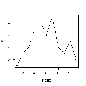
First, use c() to put the data, assumed to be in time order, into an array and use length() to check the number of observations. The first call to plot() plots the values of x against "Index", that is, the order in the array. The argument "type="b" means that the points and their connecting lines are both shown.
> x <- c(1,3,4,7,8,6,9,4,3,5,2)
> length(x)
[1] 11
> plot(x,type="b")

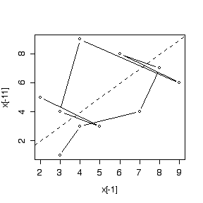
To make a lag-1 plot we need to plot x[1] on the ordinate against x[2] on the abscissa, x[2] on the ordinate against x[3] on the abscissa, and so on, up to x[10] on the ordinate against x[11] on the abscissa. This is done by plotting the array x[-11] (that is, the x array with the last observation removed) on the ordinate, against the array x[-1] (that is, the x array with the first observation removed) on the abscissa. The call to abline() adds a line with 0 intercept and unit slope, while lty=2 makes it a dashed line.
> plot(x[-1],x[-11],type="b")
> abline(0,1,lty=2)

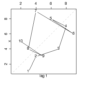
If we attach the time series library, we can also use a built-in function lag.plot() for making lag plots. Note that lag.plot() has several enhancements over the home-made lag plot: better axis labels, a square plot area, a grey dashed line for the diagonal, and the serial order of the points shown explicitly on the graph. These could, of course, be done by adding various options to the plot() call but it is easier to use the lag.plot() function. Note that the library will remain attached until the end of the session, or until detached.
> library(ts)
> lag.plot(x)